
##| code-fold: true
##| code-link: true
##| code-tools: true
##| warning: false
##| label: load-data
library(dplyr)
library(ggdark)
library(ggplot2)
library(ggridges)
library(hms)
library(knitr)
library(lubridate)
library(orgutils)
library(plotly)
library(readr)
library(reshape2)
library(scales)
library(stringr)

current_env <- Sys.getenv()
current_env["hostname"] <- Sys.info()["nodename"]

if(current_env["hostname"] == "kimura") {
    # If at home we load and parse the data
    remove_days <- c("Mon " = "", "Tue " = "", "Wed " = "", "Thu " = "", "Fri " = "", "Sat " = "", "Sun " = "")
    training_dir <- paste(current_env["HOME"], "org/training/", sep="/")
    running_log <- paste(training_dir, "log/running.org", sep="")

    data <- orgutils::readOrg(running_log, table.name="running-log")
    data <- dplyr::tibble(data)
    data <- data |>
        mutate(distance = as.double(stringr::str_replace(Distance, "km", "")),
               date = stringr::str_replace(Date, "<", ""),
               date = stringr::str_replace(date, ">", ""),
               date = stringr::str_replace(date, "\\[", ""),
               date = stringr::str_replace(date, "\\]", ""),
               date = stringr::str_replace_all(date, remove_days),
               year_month_day = stringr::str_extract(date, "[0-9]+-[0-9]+-[0-9]+"),
               time = stringr::str_replace(Time, "min \\+ ", " "),
               time = stringr::str_replace(time, "s", "")) |>
        dplyr::filter(year_month_day>= ymd("2022-01-01")) |>
        tidyr::separate(time, c("min", "sec")) |>
        mutate(date = lubridate::ymd_hm(date),
               year_month = floor_date(date, "month"),
               year_week = floor_date(date, "week"),
               year_day = lubridate::wday(date, week_start=1, label=TRUE, abbr=FALSE),
               logged_at = hms::as_hms(date),
               min = as.integer(min),
               sec = as.integer(sec),
               hour = floor(min / 60),
               min = min - (hour * 60),
               time = lubridate::hms(paste(hour, min, sec, sep=":")),
               time_sec = lubridate::period_to_seconds(time),
               time_min = lubridate::period_to_seconds(time) / 60,
               pace = as.numeric(time) / (60 * distance)) |>
        dplyr::select(-c(Date, Route, Time, Pace, year_month_day, hour, min, sec))
    # readr::write_csv(data, file="running_2022.csv")
    save(data, file="data.RData")

} else {
    # Otherwise we load parsed data.
    # data <- readr::read_csv(file="running_2022.csv", col_names = TRUE)
    load("data.RData")
}

summary_data <- data  |>
     dplyr::select(distance, pace, time)  |>
     dplyr::summarise(across(c(distance, pace, time),
                             list(sum=sum,
                                  mean=mean,
                                  sd=sd,
                                  median=median,
##                                  quantile=quantile,
                                  min=min,
                                  max=max),
.names = "{.col}_{.fn}"))I started running 🏃 in 2019. It never used to appeal but I wanted to get more regular exercise easily from my doorstep as despite commuting by bike for most of my life and cycling between 12-20km daily it wasn’t enough for me. Whilst I’ve always cycled for commuting and cycling was delightful during the pandemic lockdowns I’ve since enjoyed it less and less as it seems an increasing number of motorists seen to have little to no regard for the safety of pedestrians and cyclists. As a consequence I prefer running over cycling these days and get most of my aerobic exercise on two feet rather than two wheels.
Background
Having worked as a statistician (of different sorts) over a number of years I also like data and analysing it. I therefore record my runs (and occasional cycles). A long time ago I used to use Endomondo but didn’t like the idea of sharing my personal location data with a random company so went private and now use the privacy respecting OpenTracks1.
I use Emacs for most of my work, often using Org-mode which offers literate programming via Org-Babel and so my logged runs/cycles/hikes/climbs are summarised captured into Org files and I’ve written a literate document to process these in R and output to HTML which I host on my VPS. I can view my progress online.
At some point early in 2022 I decided to set myself an arbitrary goal of running at least 1200km in the year. It seemed a nice round number at 100km/month. This post summarises the data collected during that period and serves as a learning exercise for me to refresh/improve my R and Quarto knowledge. I used to use R when I worked as a Medical Statistician but for the last five years or so I’ve mainly used Python for work reasons. I’m keen to use Quarto as its a very neat literate programming framework (this blog is written in Quarto). The code chunks are hidden by default but can be easily expanded if you wish to look at them. I’ve summarised some of the features I’ve learnt about Quarto and I’ve explained how I use Emacs Org-mode to capture my runs.
Data
My data is captured using org-capture in an ASCII text file (for more on this setup see below), but its wrapped in an org-mode table. For the purpose of this post I have imported, filtered and redacted some of the data saved this to a .RData file having so that it works with the GitHub Action that produces the blog. The following code chunk determines where to load the file from. If I’m working on the file locally the original data is loaded and parsed before saving to .RData. In GitHub pages, the Action (CI/CD) pipeline won’t have access to the original instead it load the .RData file and its good to go with generating graphs and renders correctly.
Summary
In total in 2022 I went out running 146 times and covered a total distance of 1377.2km. Individual runs ranged from 6.43km to 32.62km (mean : 9.4328767km; standard deviation : 3.2130937km; median : 8.69km). The mean pace across all runs was 5.2192349min/km (standard deviation 0.265666; fastest : 4.754306min/km; slowest 7.1990599min/km). The total time I spent running was 4513 (mean : 30.9109589; standard deviation 1249.9327749; median : 30).
The longest run I did was the Edale Skyline ( 32.62km in 0.9833333mins) although I started in Hope and went anti-clockwise rather than the “race” circuit of starting in Edale and ascending Ringing Roger then going clockwise. This meant I had slightly less ascent to do. However by around 28-29km coming off of Kinder and passing Hope Cross my legs (well the tendons going into my groin!) were complaining a lot and so I basically walked the remainder up to Win Hill and very tentatively jogged back down into Hope. This data point is a bit of an outlier and so is excluded from some plots. For some reason this value isn’t correctly shown in the table below.
TODO - Calculate the inter-quartile range, tricky with across() used above? 🤔
##| code-fold: true
##| code-link: true
##| code-tools: true
##| warning: false
##| label: summary-data
##| tbl-cap-location: top
##| tbl-cap: Summary statistics for run distances, pace and time.

summary_data |>
    reshape2::melt()  |>
    tidyr::separate(variable, c("Metric", "Statistic")) |>
    dplyr::mutate(Metric = dplyr::recode(Metric, distance="Distance (km)", time="Time (min)", pace="Pace (min/km)"),
                  Statistic = dplyr::recode(Statistic, sum="Total", mean="Mean", sd="SD", min="Min.", max="Max.",
                                       median="Median"))  |>
    tidyr::pivot_wider(names_from=Metric, values_from=value) |>
knitr::kable(digits=3)| Statistic | Distance (km) | Pace (min/km) | Time (min) |
|---|---|---|---|
| Total | 1377.200 | 762.008 | 4513.000 |
| Mean | 9.433 | 5.219 | 30.911 |
| SD | 3.213 | 0.266 | 1249.933 |
| Median | 8.690 | 5.193 | 30.000 |
| Min. | 6.430 | 4.754 | 0.000 |
| Max. | 32.620 | 7.199 | 59.000 |
For some reason
Number of Runs
How often I go running varies depending on the distance I’ve done recently and more importantly whether I’m carrying an injury of some sort.
##| code-fold: true
##| code-link: true
##| code-tools: true
##| warning: false
##| label: number-of-runs
##| fig-cap-location: top
##| fig-cap: "Runs per by Month and Week"
##| fig-subcap:
##|    - "Runs by month"
##|    - "Runs by week"
##| fig-alt: "A plot of runs per month/week in 2022."
month <- data |> ggplot(aes(year_month)) +
    geom_bar() +
    dark_theme_bw() +
    ylab("Runs") +
    xlab("Month/Year") +
    scale_x_datetime(breaks = date_breaks("1 month"), labels=date_format("%B")) +
    theme(axis.text.x = element_text(angle=30, hjust=1))
ggplotly(month)
week <- data |> ggplot(aes(year_week)) +
geom_bar() +
dark_theme_bw() +
ylab("Runs") +
xlab("Week") +
scale_x_datetime(breaks = date_breaks("2 weeks")) + ##, labels=date_format("%w")) +
theme(axis.text.x = element_text(angle=30, hjust=1))
ggplotly(week)–
Distance
I prefer longer runs, I often feel I’m only getting going and into a rhythm after 3-5km and therefore struggle to find motivation to go out for short runs. That said, whilst I can run > 21km (half-marathon) distances I don’t do so often and past experience tells me that if I run too much I end up injuring myself.
##| code-fold: true
##| code-link: true
##| code-tools: true
##| warning: false
##| fig-cap-location: top
##| label: distance-time-series
##| fig-cap: "Distance of Runs."
##| fig-alt: "A plot of distance of runs in 2022."
distance_time <- data |>
    ggplot(aes(date, distance)) +
    geom_line() +
    geom_smooth(method="loess") +
    dark_theme_bw() +
    ylab("Distance (km)") +
    xlab("Date") +
    # scale_color_gradientn(colors = c("#00AFBB", "#E7B800", "#FC4E07")) +
    theme(legend.position = "right") +
    scale_x_datetime(breaks = date_breaks("1 month"), labels=date_format("%b"))
ggplotly(distance_time)
Distance By Month
March was a fallow month for running as I had a sore knee and a month of work and so I did a lot of cycling (A57 Snake Pass when it was closed, a morning jaunt to Bakewell and back) and DIY around the home and garden (finishing off a patio). I also had to ease off from mid-November and most of December due to a sore thigh.
##| code-fold: true
##| code-link: true
##| code-tools: true
##| warning: true
##| fig-cap-location: top
##| label: distance-per-month
##| fig-cap: "Distance per month."
##| fig-subcap:
##|    - "Bar Chart"
##|    - "Box Plot"
##|    - "Ridge Density"
##| fig-alt: "A plot of distance per month/week in 2022."
bar_distance_month <- data |> ggplot(aes(year_month)) +
    geom_bar(aes(weight = distance)) +
    dark_theme_bw() +
    ylab("Distance (km)") +
    xlab("Month/Year")  +
    scale_x_datetime(breaks = date_breaks("1 month"), labels=date_format("%B"))
    ## theme(axis.text.x = element_text(angle=30, hjust=1))
ggplotly(bar_distance_month)
box_distance_month <- data |> ggplot(aes(year_month, distance)) +
geom_boxplot(aes(factor(year_month), distance)) +
dark_theme_bw() +
ylab("Distance (km)") +
xlab("Month/Year")
## scale_x_datetime(breaks = date_breaks("1 month")) + ##, labels=date_format("%B"))
## theme(axis.text.x = element_text(angle=30, hjust=1))
ggplotly(box_distance_month)ridge_distance_month <- data |> ggplot(aes(x=distance, y=factor(year_month), group=year_month, fill=after_stat(x))) +
# geom_density_ridges_gradient(scale=1, gradient_lwd=1.) +
geom_density_ridges_gradient(gradient_lwd=1.) +
scale_x_continuous(expand = c(0, 0)) +
scale_fill_viridis_c(name="Distance (km)", option="C") +
dark_theme_bw() +
ylab("Year") +
xlab("Distance (km)") ## +
## scale_y_datetime(breaks = date_breaks("1 month"), labels=date_format("%B"))
### ggplotly(ridge_distance_month)
ridge_distance_month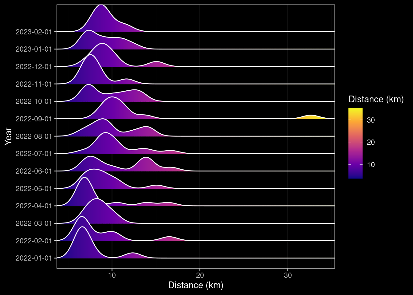
dev.off()null device
1 Distance By Week
##| code-fold: true
##| code-link: true
##| code-tools: true
##| warning: false
##| fig-cap-location: top
##| label: distance-per-week
##| fig-cap: "Distance per week."
##| fig-subcap:
##|    - "Bar Chart"
##|    - "Box Plot"
##| fig-alt: "Plots of distance per month in 2022."
bar_distance_week <- data |> ggplot(aes(year_week)) +
    geom_bar(aes(weight = distance)) +
    dark_theme_bw() +
    ylab("Distance (km)") +
    xlab("Month/Year")  +
    ## scale_x_datetime(breaks = date_breaks("1 month"), labels=date_format("%w"))
    theme(axis.text.x = element_text(angle=30, hjust=1))

ggplotly(bar_distance_week)
box_distance_week <- data |> ggplot(aes(factor(year_week), distance)) +
geom_boxplot() +
dark_theme_bw() +
ylab("Distance (km)") +
xlab("Month/Year") +
## scale_x_datetime(breaks = date_breaks("2 weeks")) + ##, labels=date_format("%w")) +
theme(axis.text.x = element_text(angle=30, hjust=1))
ggplotly(box_distance_week)Runs v Distance
Lets look at how the number of runs per week affects the overall distance covered. Do I keep to a consistent distance if I’m doing less runs by doing longer runs? We can look at that by plotting the number of runs per week against either the total distance or the mean distance for that week. If I do fewer longer runs there should be a downwards trend, with weeks where I only run once having very high values, and weeks where I do multiple runs having very low means.
##| code-fold: true
##| code-link: true
##| code-tools: true
##| warning: false
##| fig-cap-location: top
##| label: runs-distance
##| fig-cap: "Runs per week v Distance"
##| fig-subcap:
##|    - Total Distance
##|    - Mean Distance
##| fig-alt: "A plot of number of runs per week and the distanace covered in 2022."
tmp_data <- data |>
    group_by(year_week) |>
    summarise(runs = n(),
              distance_total= sum(distance),
              distance_mean = mean(distance))
runs_distance_total<- tmp_data |>
    ggplot(aes(runs, distance_total)) +
    geom_point(aes(color=distance_mean, size=distance_mean, alpha=0.45)) +
    geom_smooth(method="loess") +
    dark_theme_bw() +
    ylab("Total Distance (km)") +
    xlab("Runs (km)") +
    scale_color_gradientn(colors = c("#00AFBB", "#E7B800", "#FC4E07")) +
    theme(legend.position = "right")
ggplotly(runs_distance_total, tooltip = c("year_week", "distance_total", "distance_mean"))
runs_distance_mean <- tmp_data |>
ggplot(aes(runs, distance_mean, label=year_week)) +
geom_point(aes(color=distance_total, size=distance_total, alpha=0.45)) +
geom_smooth(method="loess") +
dark_theme_bw() +
ylab("Mean Distance (km)") +
xlab("Runs (km)") +
scale_color_gradientn(colors = c("#00AFBB", "#E7B800", "#FC4E07")) +
theme(legend.position = "right")
ggplotly(runs_distance_mean, tooltip = c("year_week", "distance_total", "distance_mean"))Pace
I like pushing myself and going fast, I perhaps stupidly and against much perceived wisdom, think that if I’m able to hold a conversation then I’m not trying hard enough (in reality I rarely try talking as I always run on my own).
Before looking at pace over time its interesting to look at the relationship between distance and time. Obviously longer runs are going to take longer, but is the relationship linear or do I get slower the further I go?
##| code-fold: true
##| code-link: true
##| code-tools: true
##| warning: false
##| fig-cap-location: top
##| label: distance-v-time
##| fig-cap: "Distance v Pace."
##| fig-subcap:
##|    - All
##|    - Excluding Outliers
##| fig-alt: "Distance v Pace for runs in 2022."
distance_time_all <- data |>
    ggplot(aes(distance, pace)) +
    geom_point(aes(color=distance, size=distance)) +
    geom_smooth(method="loess") +
    dark_theme_bw() +
    ylab("Pace (min/km)") +
    xlab("Distance") +
    scale_color_gradientn(colors = c("#00AFBB", "#E7B800", "#FC4E07")) +
    theme(legend.position = "right")
ggplotly(distance_time_all)
distance_time_excl_outliers <- data |>
dplyr::filter(pace < 7) |>
ggplot(aes(distance, pace)) +
geom_point(aes(color=distance, size=distance)) +
geom_smooth(method="loess") +
dark_theme_bw() +
ylab("Pace (min/km)") +
xlab("Distance") +
scale_color_gradientn(colors = c("#00AFBB", "#E7B800", "#FC4E07")) +
theme(legend.position = "right")
ggplotly(distance_time_excl_outliers)The relationship between distance and pace is interesting, one might expect that the pace decreases with the overall distance, but it depends on the terrain. Most of my shorter runs involved a fair proportion of uphill as I live in the bottom of a valley and my typical circuit takes me up the valley to some extent before turning around and heading back. Longer runs I would typically get out of the valley and run along fairly flat ground before heading back down and I think this is what causes the dip in the above graph (excluding outliers) in the range of 11-14km, but further distances I tire and so my pace drops.
Looking at pace over time it increases as the year progresses but then runs are getting gradually longer, and I know I changed the route to include more hills. Strangely getting COVID at the end of August didn’t appear to negatively impact my pace although running with an injury late November/December did (I should probably have had a break but wanted to reach my goal so dialled down the frequency and distance).
##| code-fold: true
##| code-link: true
##| code-tools: true
##| warning: false
##| fig-cap-location: top
##| label: pace-overtime
##| fig-cap: "Pace over time by distance."
##| fig-alt: "A plot of distance per month/week in 2022."
no_outliers <- data |>
    dplyr::filter(pace < 7)
pace_timeseries<- data |>
    ggplot(aes(date, pace)) +
    geom_point(aes(color=distance, size=distance)) +
    geom_smooth(method="loess", data=no_outliers) +
    dark_theme_bw() +
    ylab("Pace (min/km)") +
    xlab("Date") +
    scale_color_gradientn(colors = c("#00AFBB", "#E7B800", "#FC4E07")) +
    theme(legend.position = "right") +
    scale_x_datetime(breaks = date_breaks("1 month"), labels=date_format("%b"))
ggplotly(pace_timeseries)
Pace By Month
##| code-fold: true
##| code-link: true
##| code-tools: true
##| warning: false
##| fig-cap-location: top
##| label: pace-per-month
##| fig-cap: "Pace per month."
##| fig-subcap:
##|    - "Box Plot"
##|    - "Ridge Density"
##| fig-alt: "A plot of pace per month/week in 2022."
box_pace_month <- data |> ggplot(aes(factor(year_month), pace)) +
    geom_boxplot() +
    dark_theme_bw() +
    ylab("Pace (min/km)") +
    xlab("Month/Year") ## +
### scale_x_datetime(breaks = date_breaks("2 weeks"), labels=date_format("%B"))
ggplotly(box_pace_month)
ridge_pace_month <- data |> ggplot(aes(x=pace, y=factor(year_month), group=year_month, fill=after_stat(x))) +
# geom_density_ridges_gradient(scale=1, gradient_lwd=1.) +
geom_density_ridges_gradient(scale=1, gradient_lwd=1.) +
scale_x_continuous(expand = c(0, 0)) +
# scale_y_discrete(expand = expansion(mult = c(0.01, 0.25))) +
scale_fill_viridis_c(name="Pace (min/km)", option="C") +
dark_theme_bw() +
ylab("Year") +
xlab("Pace (min/km)") ## +
### scale_x_datetime(breaks = date_breaks("1 month"), labels=date_format("%B"))
### ggplotly(ridge_pace_month)
ridge_pace_month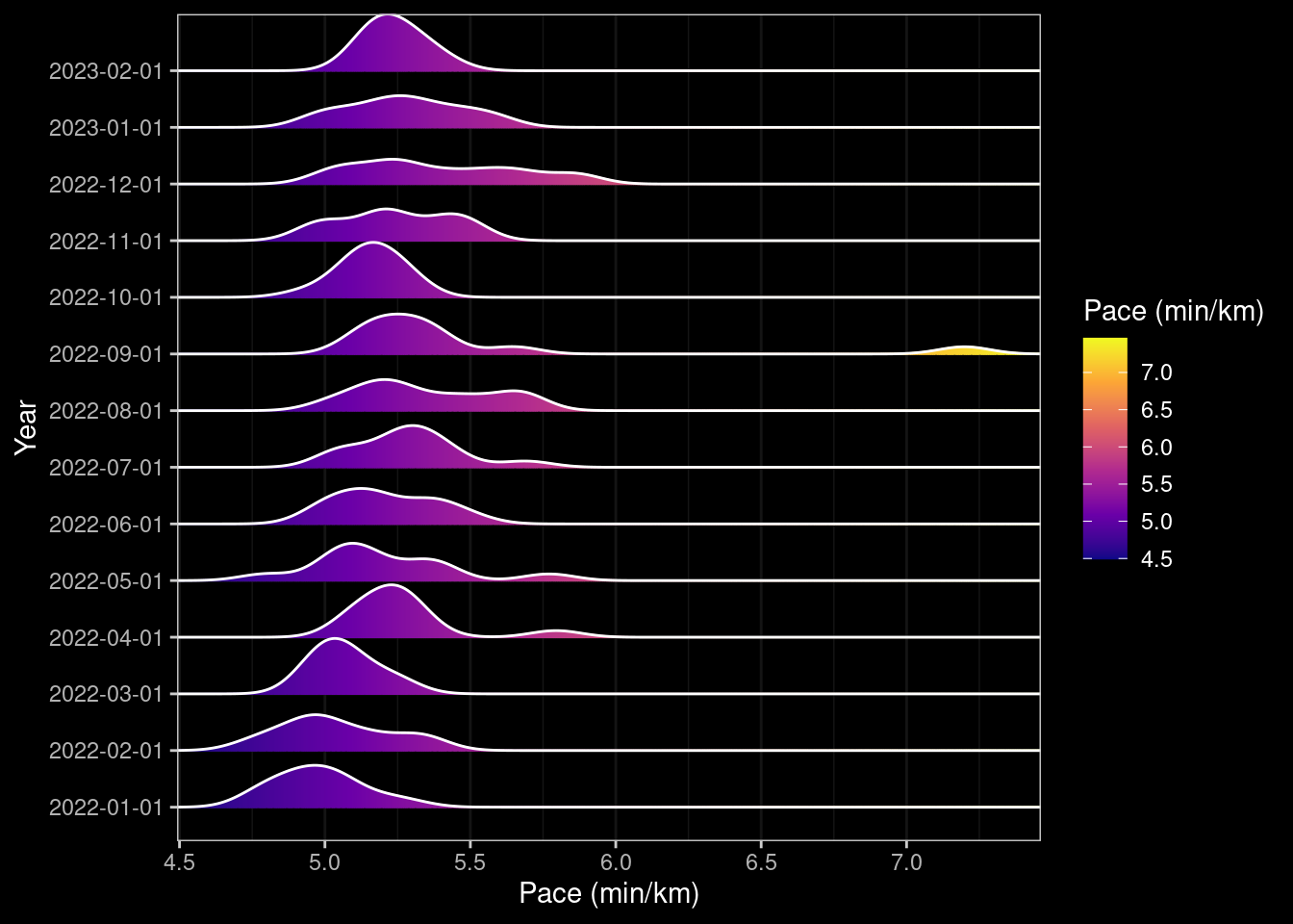
Pace By Week
##| code-fold: true
##| code-link: true
##| code-tools: true
##| warning: false
##| fig-cap-location: top
##| label: pace-per-week
##| fig-cap: "Pace per week."
##| fig-alt: "Plots of pace per month in 2022."
box_pace_week <- data |> ggplot(aes(factor(year_week), pace)) +
    geom_boxplot() +
    dark_theme_bw() +
    ylab("Pace (min/km)") +
    xlab("Month/Year") +
    ## scale_x_datetime(breaks = date_breaks("2 weeks"), labels=date_format("%w")) +
    theme(axis.text.x = element_text(angle=30, hjust=1))
ggplotly(box_pace_week)
When Do I Run?
I’m much more a morning person and typically go out running on an empty stomach as I find it quite unpleasant to have a bellyful of food jiggling around inside me. But what days of the week and times do I actually go running? I can answer this with only a low degree of accuracy because whilst I do try to log my runs immediately after having completed them (post-stretching!) I don’t always do so and so the times below reflect the times I logged the run rather than started.
In the summer when it gets light early I’ll sometimes go out running at 06:00 but clearly these are not reflected in the logged times.
##| code-fold: true
##| code-link: true
##| code-tools: true
##| warning: false
##| fig-cap-location: top
##| label: when-I-run
##| fig-cap: "When I go running."
##| fig-subcap:
##|    - "Day"
##|    - "Time"
##|    - "Month v Time"
##|    - "Day v Time"
##| fig-alt: "When I go running"
what_day_I_run <- data  |> ggplot(aes(year_day)) +
    geom_bar() +
    dark_theme_bw() +
    xlab("Day of Week") +
    ylab("N")
ggplotly(what_day_I_run)
when_I_run <- data |> ggplot(aes(logged_at)) +
geom_bar() +
dark_theme_bw() +
xlab("Time of Day") +
ylab("N")
ggplotly(when_I_run)what_time_I_run_by_month <- data |> ggplot(aes(year_month, logged_at)) +
geom_point() +
geom_smooth(method="loess") +
dark_theme_bw() +
xlab("Month") +
ylab("Time of Day")
ggplotly(what_time_I_run_by_month)what_time_I_run_each_day <- data |> ggplot(aes(year_day, logged_at)) +
geom_point() +
geom_smooth(method="loess") +
dark_theme_bw() +
xlab("Day of Week") +
ylab("Time of Day")
ggplotly(what_time_I_run_each_day)Does distance differ with time of day?
If I go out running in the morning I usually go further because I work five days a week and lunch-time runs have to fit within an hour. As you can see I don’t generally run in the evening as I don’t like exercising with food in my stomach.
##| code-fold: true
##| code-link: true
##| code-tools: true
##| warning: false
##| fig-cap-location: top
##| label: when-I-run-distance
##| fig-cap: "Time of Day v Distance."
##| fig-alt: "Time of day I go running v distance"
when_I_run_distance <- data |> ggplot(aes(logged_at, distance)) +
    geom_point(aes(color=distance, size=distance)) +
    geom_smooth() +
    dark_theme_bw() +
    xlab("Time of Day") +
    ylab("Distance") +
    scale_color_gradientn(colors = c("#00AFBB", "#E7B800", "#FC4E07")) +
    theme(legend.position = "right") ## +
    ## scale_x_datetime(breaks = date_breaks("1 hour"), labels=date_format("%H"))
ggplotly(when_I_run_distance)
Does pace differ with time of day?
As I’ve mentioned I somewhat counter-intuitively get a faster mean pace when going further distances. Does this feature come through with the time of day and do I run faster in the morning or at other times. The graph below plots the time of day against the pace with the distance denoted by the size and colour of points.
##| code-fold: true
##| code-link: true
##| code-tools: true
##| warning: false
##| fig-cap-location: top
##| label: when-I-run-pace
##| fig-cap: "When I go running v pace."
##| fig-alt: "Time of day I go running v pace"
when_I_run_pace <- data |> ggplot(aes(logged_at, pace)) +
    geom_point(aes(color=distance, size=distance)) +
    geom_smooth() +
    dark_theme_bw() +
    xlab("Time of Day") +
    ylab("Pace") +
    scale_color_gradientn(colors = c("#00AFBB", "#E7B800", "#FC4E07")) +
    theme(legend.position = "right") ## +
    ## scale_x_datetime(breaks = date_breaks("1 hour"), labels=date_format("%H"))
ggplotly(when_I_run_pace)
I could go on and on making different types of plots but I think that is sufficient for now.
Capturing Data in Emacs Org-mode
I thought it would be worthwhile including a section on how I capture data. Its not perfect (yet!) because as mentioned I use OpenTracks to log my runs. This saves data to a GPX file on finishing on my phone and I use SyncThing to back these up automatically to my server using a run condition so it only tries to do so when the phone is connected to my home WiFi network and the phone is charging. At some point I will take advantage of this and develop a dashboard that loads the GPX data and allows interactive exploration as well as summarising the data similar to that which I’ve presented here. But life is busy so for now I manually capture the summary statistics using Org-mode and Org Capture templates.
I have a file ~/path/to/running.org which contains an Org table as shown below.
##+CAPTION: Running Log
##+NAME: running-log
| Date                   | Route                     | Distance | Time         | Pace                           | Notes     |
|------------------------+---------------------------+----------+--------------+--------------------------------+-----------|
| [2022-12-25 Sun 10:17] | From here to there.       | 9.17km   | 48min + 06s  | 5 min / km + 14.721919 s / km  | Felt ok   |
| [2022-12-21 Wed 13:20] | A to B via C              | 9.81km   | 49min + 14s  | 5 min / km + 1.1213048 s / km  | No falls! |
| [2022-12-17 Sat 09:08] | There and back            | 15.05km  | 79min + 03s  | 5 min / km + 15.149502 s / km  | Not bad   |
|------------------------+---------------------------+----------+--------------+--------------------------------+-----------|
##+TBLFM: $5=uconvert($4/$3, (min+s)/km);L
The layout is I think self-explanatory and each time I want to log a run I could open the file C-x C-f ~/path/to/running.org, navigate to the top of the file and start entering details manually in a new row. But that is a bit slow and instead I wrote an Org-capture rule to capture runs (and many other things). Writing these was initially a bit tricky (as I’m a slow learner) but I now understand the structure and can quickly add new entries to capture items where I want them to be, saving me time in the long run.
(use-package org-capture
         :ensure nil
         :after org-gtd
         :config
         (setq org-default-notes-file (concat org-directory "/notes.org"))
         (setq org-capture-templates
           '(("e" "Exercise")
             ("er" "Logging a run" table-line (file+olp "~/path/to/running.org")
              "| %U | %? | km | min + s | | |" :prepend t)
             ("ec" "Logging a cycle" table-line (file+olp "~/path/to/cycling.org")
              "| %U | %? | km | min + s | | |" :prepend t)
             ("eh" "Logging a hike" table-line (file+olp "~/path/to/hiking.org")
              "| %U | %? | km | m | min + s| |" :prepend t)
             ("em" "Weight & Waist/Hip" table-line (file+olp "~/path/to/metrics_weight.org")
              "| %U | %? | | | |" :prepend t)
             ("es" "Steps" table-line (file+olp "~/path/to/metrics_steps.org")
              "| %t | %? |" :prepend t)
             ("eb" "Blood" table-line (file+olp "~/path/to/metrics_blood.org")
              "| %U | %? | | | | | |" :prepend t))))
To enter Org-capture its C-c c this brings up a menu for all of the capture templates I’ve defined…
Select a capture template
=========================

[E]  Email
[a]  Agenda
[e]  Exercise
[w]  Work
Exercise is entered by pressing e as defined on the line ("e" "Exercise"). I then see a sub-menu…
Select a capture template
=========================

e [r]  Logging a run
e [c]  Logging a cycle
e [h]  Logging a hike
e [m]  Weight & Waist/Hip
e [s]  Steps
e [b]  Blood
…and I can choose what activity to log, hit r for a run and a new buffer appears, the date and time is entered automatically because that field is set to be %U in the template. The cursor is located in the Route column because the field content is %? which means user input is required. The Distance, Time and Notes fields are also completed although the Pace field should be left blank since the formula at the bottom of the table (#+TBLFM: $5=uconvert($4/$3, (min+s)/km);L) calculates this automatically on saving.
Capture buffer, Finish 'C-c C-c', refile 'C-c C-w', abort 'C-c C-k'
| [2022-12-27 Tue 11:29] | Out for a run | 10.8km | 54min + 12s | | Fun run in the snow. |
Once all the fields are completed press C-c C-c to save the changes and the row is added to the table in the file ~/path/to/running.org. This file forms part of my training.org (its pulled into the main document training.org using #+INCLUDE: ~/path/to/running.org), but the data is used and processed using R. How does the data get from the org-formatted table into the R session as a data frame for summarising and using? This is part of the amazing magic that is Org-babel for literate programming. A source code chunk can be defined with a :var option which refers to the table you want to include. In this my source block does some processing of the table to tidy up the dates into something R understands and is shown below.
##+begin_src R :session *training-R* :eval yes :exports none :var running_table=running-log  :colnames nil :results output silent
  running_table %<>% mutate(distance = as.double(str_replace(Distance, "km", "")),
             time = str_replace(Time, "min \\+ ", " "),
             time = str_replace(time, "s", ""),
             Date = str_extract(Date, "[0-9]+-[0-9]+-[0-9]+"),
             date = ymd(Date),
             year = floor_date(date, "year"),
             year_month = floor_date(date, "month"),
             year_week = floor_date(date, "week")) %>%
      separate(time, c("min", "sec")) %>%
      mutate(min = as.integer(min),
             sec = as.integer(sec),
             hour = floor(min / 60),
             min = min - (hour * 60),
             # time = chron(time=paste(hour, min, sec, sep=":")),
             time = hms(paste(hour, min, sec, sep=":")),
             pace = as.numeric(time) / (60 * distance)) %>%
             # pace = Pace) %>%
      select(-c(Date, Distance, Time, Pace, hour, min, sec))
##+end_src
The key to getting the Org-mode table (which has the #+NAME: running-log) into the R session (which is set to :session *training-R* and is evaluated :eval yes) is the option :var running_table=running-log which makes the table available in the R session as the dataframe running_table. As you’ll see from the very first code chunk at the top of this post because this document is written in Quarto I instead use the orgutils::readOrg() package/function to read the table into R directly.
Quarto - Things I’ve learnt
Some things I’ve learnt about Quarto whilst preparing this document.
Code Folding
It should be possible to set options at the global level by setting the following in the site index.qmd.
execute:
  code-fold: true
  code-tools: true
  code-link: true
I’m using the blogging feature of Quarto but adding this to the site index.qmd didn’t work when previewed locally. I tried adding it to the YAML header for the post itself (i.e. posts/running-2022/index.qmd) but no joy, the code chunks were still displayed. I could however set this on a per-chunk basis though so each code chunk carries the options.
##| code-fold: true
##| code-link: true
##| code-tools: true
##| warning: false
Table and Figure caption locations are should be configurable
Captions were by default underneath each picture which is perhaps ok when reading as a PDF but this is rendered as HTML and I would prefer these to be at the top so that readers see the heading as they scroll down (I’m often torn about figure headings and labels and feel they should be included in the image itself so they are retained if/when they are used elsewhere).
Fortunately you can specify the location of table and figure captions. Unfortunately this doesn’t appear to render correctly when using the blogging feature and all captions are still at the bottom.
##| fig-cap-location: [top|bottom|margin]
##| tbl-cap-location: [top|bottom|margin]
Two for the price of one
Its possible to include two or more sub-figures in a code chunk and have them both displayed.
##| label: pace-per-month
##| fig-cap: "Pace per month."
##| fig-subcap:
##|    - "Bar Chart"
##|    - "Box Plot"
##| fig-alt: "A plot of pace per month/week in 2022."
In the output format of the blog these do not appear side by side, but rather underneath each other.
Plotly plays with Quarto
Using the plotly R package with Quarto “Just Works”, the plots render nicely in the page and are zoom-able with tool-tips appearing over key points.
Some graphs appear where I don’t expect them to
Astute readers will notice that some of the ridge plot graphs appear more than once. I couldn’t work out why this was, the code does not specify that they should be shown again. For example the Ridge Density plot for total Distance by Month also appeared under the total Distance by Week. To try working around this I attempted to explicitly use dev.off() after the initial generation of the first Ridge Density Plot, but this had the undesired effect of including output from the call and an additional code-chunk. Not one I’ve sorted yet. 🤔
Emoji’s
To include emoji’s in the Markdown it’s necessary to add the following to the header of the specific page (i.e. posts/running_2022/index.qmd)
from: markdown+emojiText based emoji names (e.g. :thinking: 🤔 ; :snake 🐍 ; :tada: 🎉) are then automatically included when rendering.
R - Things I’ve forgotten remembered
Its been a few years since I used R on a daily basis. As a consequence I thought I’d forgotten a bunch of things I used to know how to do, but this exercise has reminded me that I perhaps have some vestigial remnants of my old knowledge lingering. Some things I had to look up and, unsurprisingly, the available tools, functions/methods have evolved in that time (viz. tidyr is now more generic and simpler than reshape2).
Formatting Dates/Times in Axes
I’ve a few more niggles to round out such as the formatting of the months/weeks which I should probably do up-front in the dataframe rather leaving them as POSIXct objects as then the and then the ggplot2 functions scale_x_datetime() can be used directly (in some places I convert to factors which doesn’t help).
Previewing Graphs
One very nice feature I discovered recently courtesy of a short video by Bruno Rodrigues (thanks Bruno 👍) is the ability to preview graphs in the browser. This is unlikely to be something you need if you use RStudio but as with most things I use Emacs and Emacs Speaks Statistics and so normally I get an individual X-window appearing showing the plot. Instead we can use the httpgd package to start web-server that renders the images. It keeps a history of lots that have been produced and you can scroll back and forth through them.
> httpgd::hgd()
httpgd server running at:
  http://127.0.0.1:42729/live?token=beRmYcSn
Then just create your plots and hey-presto the graphs appear at the URL. 🧙
renv
In order to have this page publish correctly I had to initialise a renv within the repository and include the renv.lockfile so that the GitHub action/workflow installed all of the packages I use and their dependencies in the runner that renders the blog.
Whilst I’m familiar with virtual environments under Python this is something relatively new to me for R. I won’t write much other than the process involved initialising the environment, installing the dependencies then updating the lockfile.
> renv::init()
> install.packages(c("dplyr", "ggdark", "ggridges", "hms", "knitr", "lubridate", "orgutils", "plotly", "readr",
                     "scales", "stringr"))
> renv::snapshot()
> q()
git add renv.lockfile
Conclusion
Its been a fun exercise digging back into R and learning more about Quarto. If you’ve some data and an urge to summarise it I’d recommend having a play, although since Quarto supports more than just R you could alternatively use Python packages such as Pandas and Matplotlib to achieve the same. Here’s to more running 🏃 and maybe finding the time to write the Shiny dashboard to do a lot of this automatically and on the fly as I log runs in 2023 and beyond.
Links
No matching items
Footnotes
Reuse
Citation
BibTeX citation:
@online{shephard2022,
  author = {Neil Shephard},
  title = {Running in 2022},
  date = {2022-12-31},
  url = {https://blog.nshephard.dev//posts/running-2022},
  langid = {en}
}
For attribution, please cite this work as:
Neil Shephard. 2022. “Running in 2022.” December 31, 2022.
https://blog.nshephard.dev//posts/running-2022.